I have found designing my Creative CV and Cover Page such a challenge! The workshops I took part in at LCA helped so much but I am still struggling with making a decision about final designs - I am still not happy with it! I want to start sending them out though so I will have to just make a temporary decision for now and continue working on it in my spare time.
The workshops held at uni have helped me with the content and layout of the CV as well as the importance of a Cover Page when applying for a job or internship. For the design of the header itself I knew there needed to be a focus on wasps and perhaps even wigs (!) to tie in to my blog and illustration pages name 'A Wasp in a Wig'. I still need to put an explanation and illustrated description of this name and why I have used it on my website in my 'About' page.
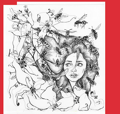
For the designs for the headers and side bars I was inspired by a lot of the CVs uploaded to Pinterest and I decided to follow a theme of a darker more complicated header combined with a paler but similar side bar. The side bar has more writing so it was best not to over-complicate this with an image. I started off the wasp illustrations by drawing some roughs and then more detailed ideas in my sketchbook; I came up with these illustrations (below) with the idea that if I made it quite a complex image the possibilities for cropping and adapting the same image for multiple purposes and looks would be a lot more flexible and achievable.
 |
| One of my initial black pen illustrations focusing on the theme of wasps. |
I decided to go for two slightly different adaptations of the same design for my cover page and CV headers. I wanted the font on the header to be white to contrast with the rest of the page. So because the cover page had more information on the header, I thought this design needed to be a darker shade with less white elements. I also liked the upside down rotation of the image for the Cover Page as it fitted in best with the font this way. I think it worked best like this as it left some black space of colour where the writing was on the left hand side. However for the CV itself I kept the image the right way up because there was less writing and a blank space to the left of the header. This was where the header joined the side panel so having the illustration 'come out' of this area worked well. I also kept it a lighter shade of purple because the only writing (my name and course) could be moved to the area of blank colour.
I kept forgetting to change the bottom panel where I kept the icons for my social networks and contact details on my CV. But it was very important this was always the right colour scheme for the rest of my designs.
Here are my current designs for my CV and Cover Page. I really wanted to fit in a photograph or my logo but I thought this may over complicate the image of the header. I think I will play about with another design and colour scheme that can support my logo or photograph. But these will do for now!
 |
| COVER PAGE TEMPLATE |
 |
| CV TEMPLATE |


No comments:
Post a Comment