Sunday 17 November 2013

OUIL403 Visual Skills - End of Module Evaluation

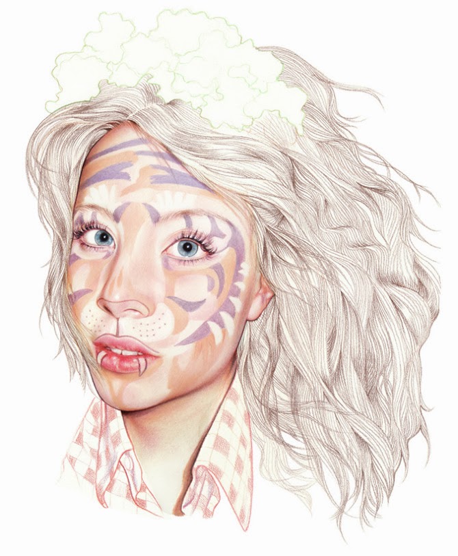
The skills I have developed through this brief have been mainly linked to idea development and the exploration of conceptual ideas. This is because I have previously not put enough into this stage of the process; now I am much more aware of the necessity of coming up with as many potential ideas as possible in order to get the best from your work. In this forth brief in particular I have been developing my skills using media and colour as this is a passion I have not yet carried through with in my other projects. I have felt restricted by the colour constraints and I really enjoyed just using whichever colours and media I wanted for the Brief 4 final pieces. I think I have applied these skills effectively as I really think they convey the emotional connotations with each season that I intended. I also think it was effective in bringing alive the end result and bought attention to the quote and to the line drawings without swamping them; I feel the two elements were complimentary.

I have developed my approach to image making through experimentation with layout and form; considering how the image is positioned on the page, and through understanding how this can correspond to the message I am intending to convey this has informed my concept development process. I have also thought about line work and choice of media and the methods to which I combine the two. For example, in my forth brief I have focused a lot on line work; the simple continuous line that runs across the font of the quote describing characters on a walk on its way; and the direction of and movement in the background; this method of image making informed my concept development process because of its strong link and entwinement to the meaning of the quote. My concept development process was also informed through my approach to colour and media as this imbued a lot of feeling and emotion into my pieces, this is a strength I will capitalise on through experimentation throughout future projects. 

Also experimenting with layout and positioning really informed me as I decided to go with a slight arch; I thought this was successful as it helped to signify the arch along the earth- the cycle of the sun rising and setting along the horizon; and the people across the globe. My approach to creating the characters made them universal or at least relatable through the simplicity of the figures and monotone line. I really like how my concept allowed all of the people in the piece to be connected; even if some appear lonelier than others, this is something I can capitalise on as I learnt how to connect approach with concept.


My weaknesses lie mainly in lack of experimentation in all areas as this is something I can always be improving on and there is always scope to do more and to push myself more. I need to allow myself time to fail and learn from these new ways of working and to do this I must plan my time differently; allowing more time to create experiment with layout, media, line work and concept idea development. I also think I need to think about how the final images are presented in a lot more depth and professionalism, this is something I feel would really effect the outcomes of my project and would give me a lot more pride in my work; thus motivating me to be even more of a perfectionist. 

Five things I will do in future projects and would do with this project were I to do it again would be to; explore all potential ideas, develop my ideas thoroughly, experiment even more with media, experiment with layout and cropping, and presenting work professionally. I expect from doing all these I will gain understanding in creating work to its full potential and learning a more professional way to working.  

Sunday 27 October 2013

OUIL402 PPP1: Inspiration


Currently, my favourite illustrator has to be Minni Havas because her work, both finished and sketches, are constant inspiration to me. I love her style and choice of colour palettes and that her work focuses on portraiture. I love her realistic yet imaginative style, which combines her skill and creativity to capture the personality of the individual and the atmosphere of the piece.


She describes her work as existing 'somewhere in the borderlands of the real and the imaginary.' 


A reasonably recent inspirational artist to me has been Hattie Stewart, a self confessed 'professional doodler'. I love the playfulness and feeling of fun within her work, she takes the serious subject matter and uses her artwork to allow us to breathe; to realise it is okay not to be perfect. Her work heavily influenced my final major project in my foundation course and I love how free her style is yet how carefully planned and designed the 'doodles' are.


I also love the old school style of the Australian illustrator Minna Gilligan.
 I absolutely love passionate colour in all her images and although I don't use much collage in my work I really appreciate how Minna uses it and the narrative the combination of images conveys. She manages to create one powerful image using many contrasting components. Personally, I don't think all her work is the most technically great but I love the fact that it can evoke such emotion within such simple images, and by managing this she is definitely one of my five!


Another one of my favourites is Marcel Vertes. Not only do I love the way he depicts clothing and movement but also his depiction of society and individuals. His talent in colour and line fascinate me and it amazes me how with the simplest sweep of line he can create an emotion, expression, even an entire narrative. I love how David Downtown described his work in his book 'Masters of Fashion Illustration'; 

'Of course, humour had always been a part of the fashion artist's repertoire...but Vertes went further; his drawings of the beau monde shimmer with gleeful malice, while his dancing line and joyful Dufyesque colours diverted the eye and soothed the very egos they ruffled...what he sought, and frequently found, was enchantment.'


'Like Sisters Really! Vertes could be delightfully malicious, as here, sending up the 'distinct recent phenomenon, the perpetually adolescent mother and her daughter' in 1936'.- Downtown.
'Straighten Your Tie! Vertes could never resist sending up fashionable society. This illustration appeared in Vogue in 1936.' -Downtown.


It is the satire and humour within 
Nigel Buchanan's work which makes him my fifth inspiration.
However work such as Bikini; with its ridiculous image reflecting the ridiculous lifestyle of some in society, is also juxtaposed with Philanthropist which conveys a more serious message in the mirror image of the woman at the window of a house and the woman living out of the cardboard box; this piece forces the viewer to interact with the art and think. 
Philanthropist, 2010, Good Weekend Magazine; pencil and digital.


Monday 21 October 2013

OUIL402 PP1: Study Task 2 - 'What is illustration ?' -Part 1

Choice of media 

Symplicity/minimal
Sociopolitical message
Audience specific 
Type and text
Narrative sequence 
Tone of voice
Humour
Conceptual dev/art
Detail/skill complexity
Colour
Function/ purpose 
Composition/ format 

I will be focusing on the five that most interest me including examples for each.

Choice of media

  1. Blossac, 'Rue de la Paix' - Blossac developed a stronger line and a more graphic approach in the late 1940s. The clothes from left, are by Doir; Jaques Heim and Marcel Rochas. This media is really effective because he uses strong powerful hand drawn lines for the clothes and accessories, yet for his characters faces and the background he uses fainter shades and a thinner careful line which lets the viewers eye be drawn straight to the clothes, then slowly read a deeper message conveyed through the expression and setting - basically; the clothes can speak for themselves.
  2. Tony Viramontes - CHANEL: This 1984 drawing of Chanel haute couture was originally made for La Mode en Peinture, the short-lived but highly influential magazine founded by Prosper Assouline. The media used works incredibly to portray the colour, texture shape and atmosphere of the garments. The 'fur' is obvious even in this 2D drawing. The media portrays the message just as the content does- it conveys the garment.
  3. Hattie Stewart- 'Doodle-bombed' cover. Unlike many of Stewarts 'doodle-bombs', this design came with the publishers blessing. Meire and Meire, which is responsible for the German edition of Interview Magazine, asked her to create the cover for an exhibition in the magazines honour. 'It was an awesome project,' says Stewart. 'I feel lucky to have found something I love to do and that other people are also beginning to enjoy.' Her creative process is just as spontaneous as it appears. Some aspects, such as the use of colour and distinctive strong, black lines, hark right back to Stewarts own teenage doodles.
  4. Gary Bates - 'Untitled', at debut art. The use of media for this is important as it has been generated digitally, this adds to the strangeness of the image and follows the surreal theme, the pink clouds and egg on the face would not have been able to be captured so well on a camera, yet if they had been drawn it would just look like an imaginative doodle. This way it looks real but we know its not, adding intrigue to the piece.
  5. Minna Gilligan uses drawing and collage to project the 'old skool' look. Spontaneity is key in this style of illustration, so minimal preparatory sketching is required and designs are created simply using the tools found in a school pencil case: felt tips, colouring pencils, marker pens, scissors and glue. Gilligan is a leading figure in this trend, creating two-dimensional images loaded with narrative. Her work is relatable and unpretentious, making it a perfect fit for teens. She explains 'I like the viewer to project their own experiences and associations onto the works rather than having them too locked in one place.'
Sociopolitical 

  1. Marcel Vertes- 'Like Sisters Really!' Vertes could be delightfully Malicious; here he is sending up the 'distinct recent phenomenon, the perpetually adolescent mother and her daughter' in 1936. This is something todays society can also relate to- links to the phrase 'mutton dressed as lamb':
  2. The caricaturist Georges Goursat (Sem) was a great friend of Boldini's, but that didnt prevent him from lampooning the diminutive and socially ambitious artist, here seen waltzing with the Marchesa Casati, circa 1914:
  3. Here, Martin Wallace lampoons the 'activities' and 'lifestyles' that stigmatise senior figures in the British Liberal Democrat Party: the alleged alcoholism of leader Charles Kennedy and the 'rent boy' allegations associated with Simon Hughes and Mark Oaten.
  4. Richard Stanley- This work is based on the controversy surrounding HRH The Prince of Wales' second son (Prince Harry) regarding his 'regrettable and insensitive' choice of attire for a fancy dress party; Stanley took the oppurtunity to further exacerbate the royal embarrassment.
  5. Martin Rowson - '5 Years On' published in the Guardian newspaper on September 11, 2006. This powerful image offers telling and unnerving comment:
Detail/ skill/ complexity

  1. Antonio Lopez - this complex and beautifully observed illustration was one of a series that appeared in British Vogue in July 1970. The details in the material are particularly important as Lopez was a fashion artist.

  2. Bob Peak - authoritative draughtsmanship, dazzling technique and dramatic compositional flair. Peaks 1964 poster for the musical My Fair Lady, with its details and elegant portrait of Audrey Hepburn and Rex Harrison, swirling set pieces and dramatic shifts in scale, was the first film poster to win an award from the society of illustrators.
  3.  La Fontaine de Coquillages, pochoir plate, dress by Paquin, 1914. - George Barbier (1882-1932) was a brilliant decorative artist, designer and writer. Highly prolific and endlessly inventive, in addition to contributing to the Gazette he illustrated books and designed costumes for the movies (including Valentino's Monsieur Beaucaire), the ballet and the theatre. The block colours and shades work well with the detailing. I think its a really well designed piece and it works well to convey the elaborate extravagance of her world in that dress:
  4. J.C Leyendecker - 'The Leyendecker Look' with his classical sensibility and uneming eye for design, Leyendecker was one of the twentieth century's first true commercial artists. This quintessential Arrow Collar image appeared in 1923, three years after he won the first Annual of Advertising Art in the United States award. Honestly I do not love this design but I absolutely love the detail he has put in and especially towards the postures; particularly the mans hand position and the womans eye checking down on it; it conveys so much emotion and feeling in such a small detail:
  5. 'Muse of the World' - Boldini. His swirling kinetic portrait best captures her enduring fascination and baleful gaze. The dress is by Poiret. Boldini manages to capture both the dress and her own personality in one consecutive image; they both compliment each other in the dark and intense detailed painting.
Colour 

  1. Tony Viramontes - 'Glamslam'; unapologetically glamorous and self-confident 'Viramontes Woman' was every bit as emblematic of her time as the 'Gruau Woman' forty years before. The use of black and white for the majority of the colour allows for the glamour to really shine; the lipstick, nails, earrings and bracelet are block coloured. The colour pallet is limited with only 3 being used however the image is so striking because of this and due to the strength of the red and golds chosen. It adds a sense of royalty which is a device used to exaggerate the glamorous and self-confident theme.
  2. Bob Peak - 'Yeah, Baby!' - Peak used cut out paper collage and an eye-opening colour palette to great graphic effect in the mid-60s. The block base colours add atmosphere to the image and add fun to the pieces, and whilst the colours are unrealistic the portraits are accurate so together it works well.
  3. Jaques Fabre- Whilst an excellent example of high detail and super-realism, it's content and message is overtly sentimentalised in order to advertise the product to its intended and would-be receptive audience. The colour palette is warm with positive connotations. The oranges and warm red and yellows help to attract the audience. The brown tones remind the audience of the nice taste of chocolate, this connects the audience to the image emotionally:
  4. Micah Lidberg - Secret Cities, album cover - the artwork for the cover of Secret Cities' latest album- Strange Hearts- was Lidberg's second collaboration with the band. ' Their sound is unique; it has some strange and exotic elements paired with familiar almost nostalgic themes' he says. 'I wanted an illustration that felt in line with that mood.' The colours reflect these themes with a vibrant and wide colour palette using shading but not much black.
  5. Magnus Voll Mathiassen- Self initiated Rap/Pop Face Series. Voll Mathiassen's Rap/ Pop Face series focuses on the individuals at the forefront of the mainstream music scene, e.g. Rihanna, Azealia Banks and Nicki Minaj. His interest is in their personae, rather than their music: 'I've always worked with opposites. The tough image these artists try to maintain conflicts with the ultra-commercial scene they are a part of.' In this portrait of Nicki Minaj he uses block colour and strong lines and shapes but still it is recognisably her. This is partly down to his use of colour; he identifies her bleached hair, and love of baby pink (resembling her ulter ego 'Barbie'), red is also used for the lips and cheek to represent makeup and sexuality:
Composition/format

  1. Tony Viramontes - 'Fashion Forward' - The composition of this piece conveys a message of a marching army, however this army is one of models, marching in Halston knitwear. This is thought to be one of Viramontes strongest and most evocative images, simple yet effective with the basic colours of red, white and black. The basic shapes provide a lot of information to the viewer.
  2. Antonio Lopez- 'Capucci'- the composition of this piece works very effectively to respond to the brief; to promote the designer and the dress. It is a dress by Capucci, seen from multiple angles and it appeared as a fold out in Vanity magazine in April 1983.
  3. Katy Wright provides an evocative visual accompaniment to the passage 'We can lift ourselves out of ignorance, we can find ourselves as creatures of excellence and intelligence and skill. We can be free! We can learn to fly!' 'Jonathon Livingston Seagull' by Richard Bach. The composition of this piece helps to convey the message of being backed into a corner; the repression represented by the seagull coming out of the mist pointing down upon the majority of the small seagulls and their city. The city and rocks look magical and seem to radiate light as the colour moves across the sky and rocks right to left; representing hope.
  4. Yayl IF Soso uses marker pens to jot down ideas as she travels. Fond of re-purposing everyday items such as ticket stubs and sweet wrappers, Yayl believes that all material from life can be art. The layout of this piece draws the audiences eye straight to the couple in the middle; this is a clever device to connect the two pages as the two individuals are connected, we see it as a piece of artwork rather that just random images. The layout is also effective as the words and phrases are carefully collated to compliment each other, some are laid out so that they remind the audience of speech bubbles:
  5. 'Lets Go Beyond' Mike Perry. The layout of this fun piece is very well thought out, with many components working together to form the final image. The letters are clear yet emerged in the scene:


Wednesday 16 October 2013

Leeds Gallery Visit

On the weekend I went to Leeds Gallery. It was my first time there and I thought it was really cool how they had presented the small space. There was an interesting exhibition on about making graphic art for everyone; Faces, the Anatomy of Autonomy is fun and interactive. It is an ongoing personal project by Lee Goater which he started in 2012 and called it 'responsible magnetic street-art for sharing'. He anonymously distributed 180 polaroid sized magnets around the UK. He worked with a restricted palette to create eight characters representing different genders, ages and cultures. Lee began to further question the idea of self when he was surprised by how different characters were interpreted. 


Interactive table for people to create their own Faces!

Some of my creations!


There were also magnetic white boards which allowed the public to play around with making a temporary face. I thought this was cool as it let you experience for yourself how putting the shapes in certain areas or angles affected the symbol/expression/person portrayed so vastly.

We also went to the cafe for some almond lattes and chai tea to continue our artsy day. I definitely recommend stopping off there as it adds to the charming and intimate atmosphere of the gallery. 

We also ended up staying far longer than planned looking round the shop as although it's small, it's crammed with great books on graphic design, fashion, illustration, architecture. Also it has some prints and small pieces on sale, of which I noticed some of Matt's work which looked amazing along with the others on show. 

Pages from a really interesting book I found about design related to food and branding and colour choices. It basically reinvented standard food in a way that you had to spend time just to take it in and understand what it was; art or food? 

My friends having a go