Choice of media
Symplicity/minimal
Sociopolitical message
Audience specific
Type and text
Narrative sequence
Tone of voice
Humour
Conceptual dev/art
Detail/skill complexity
Colour
Function/ purpose
Composition/ format
I will be focusing on the five that most interest me including examples for each.
Choice of media
- Blossac, 'Rue de la Paix' - Blossac developed a stronger line and a more graphic approach in the late 1940s. The clothes from left, are by Doir; Jaques Heim and Marcel Rochas. This media is really effective because he uses strong powerful hand drawn lines for the clothes and accessories, yet for his characters faces and the background he uses fainter shades and a thinner careful line which lets the viewers eye be drawn straight to the clothes, then slowly read a deeper message conveyed through the expression and setting - basically; the clothes can speak for themselves.

- Tony Viramontes - CHANEL: This 1984 drawing of Chanel haute couture was originally made for La Mode en Peinture, the short-lived but highly influential magazine founded by Prosper Assouline. The media used works incredibly to portray the colour, texture shape and atmosphere of the garments. The 'fur' is obvious even in this 2D drawing. The media portrays the message just as the content does- it conveys the garment.

- Hattie Stewart- 'Doodle-bombed' cover. Unlike many of Stewarts 'doodle-bombs', this design came with the publishers blessing. Meire and Meire, which is responsible for the German edition of Interview Magazine, asked her to create the cover for an exhibition in the magazines honour. 'It was an awesome project,' says Stewart. 'I feel lucky to have found something I love to do and that other people are also beginning to enjoy.' Her creative process is just as spontaneous as it appears. Some aspects, such as the use of colour and distinctive strong, black lines, hark right back to Stewarts own teenage doodles.

- Gary Bates - 'Untitled', at debut art. The use of media for this is important as it has been generated digitally, this adds to the strangeness of the image and follows the surreal theme, the pink clouds and egg on the face would not have been able to be captured so well on a camera, yet if they had been drawn it would just look like an imaginative doodle. This way it looks real but we know its not, adding intrigue to the piece.

- Minna Gilligan uses drawing and collage to project the 'old skool' look. Spontaneity is key in this style of illustration, so minimal preparatory sketching is required and designs are created simply using the tools found in a school pencil case: felt tips, colouring pencils, marker pens, scissors and glue. Gilligan is a leading figure in this trend, creating two-dimensional images loaded with narrative. Her work is relatable and unpretentious, making it a perfect fit for teens. She explains 'I like the viewer to project their own experiences and associations onto the works rather than having them too locked in one place.'


Sociopolitical
- Marcel Vertes- 'Like Sisters Really!' Vertes could be delightfully Malicious; here he is sending up the 'distinct recent phenomenon, the perpetually adolescent mother and her daughter' in 1936. This is something todays society can also relate to- links to the phrase 'mutton dressed as lamb':

- The caricaturist Georges Goursat (Sem) was a great friend of Boldini's, but that didnt prevent him from lampooning the diminutive and socially ambitious artist, here seen waltzing with the Marchesa Casati, circa 1914:

- Here, Martin Wallace lampoons the 'activities' and 'lifestyles' that stigmatise senior figures in the British Liberal Democrat Party: the alleged alcoholism of leader Charles Kennedy and the 'rent boy' allegations associated with Simon Hughes and Mark Oaten.

- Richard Stanley- This work is based on the controversy surrounding HRH The Prince of Wales' second son (Prince Harry) regarding his 'regrettable and insensitive' choice of attire for a fancy dress party; Stanley took the oppurtunity to further exacerbate the royal embarrassment.

- Martin Rowson - '5 Years On' published in the Guardian newspaper on September 11, 2006. This powerful image offers telling and unnerving comment:


Detail/ skill/ complexity
- Antonio Lopez - this complex and beautifully observed illustration was one of a series that appeared in British Vogue in July 1970. The details in the material are particularly important as Lopez was a fashion artist.

- Bob Peak - authoritative draughtsmanship, dazzling technique and dramatic compositional flair. Peaks 1964 poster for the musical My Fair Lady, with its details and elegant portrait of Audrey Hepburn and Rex Harrison, swirling set pieces and dramatic shifts in scale, was the first film poster to win an award from the society of illustrators.

- La Fontaine de Coquillages, pochoir plate, dress by Paquin, 1914. - George Barbier (1882-1932) was a brilliant decorative artist, designer and writer. Highly prolific and endlessly inventive, in addition to contributing to the Gazette he illustrated books and designed costumes for the movies (including Valentino's Monsieur Beaucaire), the ballet and the theatre. The block colours and shades work well with the detailing. I think its a really well designed piece and it works well to convey the elaborate extravagance of her world in that dress:

- J.C Leyendecker - 'The Leyendecker Look' with his classical sensibility and uneming eye for design, Leyendecker was one of the twentieth century's first true commercial artists. This quintessential Arrow Collar image appeared in 1923, three years after he won the first Annual of Advertising Art in the United States award. Honestly I do not love this design but I absolutely love the detail he has put in and especially towards the postures; particularly the mans hand position and the womans eye checking down on it; it conveys so much emotion and feeling in such a small detail:

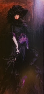
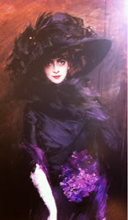
- 'Muse of the World' - Boldini. His swirling kinetic portrait best captures her enduring fascination and baleful gaze. The dress is by Poiret. Boldini manages to capture both the dress and her own personality in one consecutive image; they both compliment each other in the dark and intense detailed painting.


Colour
- Tony Viramontes - 'Glamslam'; unapologetically glamorous and self-confident 'Viramontes Woman' was every bit as emblematic of her time as the 'Gruau Woman' forty years before. The use of black and white for the majority of the colour allows for the glamour to really shine; the lipstick, nails, earrings and bracelet are block coloured. The colour pallet is limited with only 3 being used however the image is so striking because of this and due to the strength of the red and golds chosen. It adds a sense of royalty which is a device used to exaggerate the glamorous and self-confident theme.

- Bob Peak - 'Yeah, Baby!' - Peak used cut out paper collage and an eye-opening colour palette to great graphic effect in the mid-60s. The block base colours add atmosphere to the image and add fun to the pieces, and whilst the colours are unrealistic the portraits are accurate so together it works well.

- Jaques Fabre- Whilst an excellent example of high detail and super-realism, it's content and message is overtly sentimentalised in order to advertise the product to its intended and would-be receptive audience. The colour palette is warm with positive connotations. The oranges and warm red and yellows help to attract the audience. The brown tones remind the audience of the nice taste of chocolate, this connects the audience to the image emotionally:

- Micah Lidberg - Secret Cities, album cover - the artwork for the cover of Secret Cities' latest album- Strange Hearts- was Lidberg's second collaboration with the band. ' Their sound is unique; it has some strange and exotic elements paired with familiar almost nostalgic themes' he says. 'I wanted an illustration that felt in line with that mood.' The colours reflect these themes with a vibrant and wide colour palette using shading but not much black.

- Magnus Voll Mathiassen- Self initiated Rap/Pop Face Series. Voll Mathiassen's Rap/ Pop Face series focuses on the individuals at the forefront of the mainstream music scene, e.g. Rihanna, Azealia Banks and Nicki Minaj. His interest is in their personae, rather than their music: 'I've always worked with opposites. The tough image these artists try to maintain conflicts with the ultra-commercial scene they are a part of.' In this portrait of Nicki Minaj he uses block colour and strong lines and shapes but still it is recognisably her. This is partly down to his use of colour; he identifies her bleached hair, and love of baby pink (resembling her ulter ego 'Barbie'), red is also used for the lips and cheek to represent makeup and sexuality:


Composition/format
- Tony Viramontes - 'Fashion Forward' - The composition of this piece conveys a message of a marching army, however this army is one of models, marching in Halston knitwear. This is thought to be one of Viramontes strongest and most evocative images, simple yet effective with the basic colours of red, white and black. The basic shapes provide a lot of information to the viewer.

- Antonio Lopez- 'Capucci'- the composition of this piece works very effectively to respond to the brief; to promote the designer and the dress. It is a dress by Capucci, seen from multiple angles and it appeared as a fold out in Vanity magazine in April 1983.

- Katy Wright provides an evocative visual accompaniment to the passage 'We can lift ourselves out of ignorance, we can find ourselves as creatures of excellence and intelligence and skill. We can be free! We can learn to fly!' 'Jonathon Livingston Seagull' by Richard Bach. The composition of this piece helps to convey the message of being backed into a corner; the repression represented by the seagull coming out of the mist pointing down upon the majority of the small seagulls and their city. The city and rocks look magical and seem to radiate light as the colour moves across the sky and rocks right to left; representing hope.

- Yayl IF Soso uses marker pens to jot down ideas as she travels. Fond of re-purposing everyday items such as ticket stubs and sweet wrappers, Yayl believes that all material from life can be art. The layout of this piece draws the audiences eye straight to the couple in the middle; this is a clever device to connect the two pages as the two individuals are connected, we see it as a piece of artwork rather that just random images. The layout is also effective as the words and phrases are carefully collated to compliment each other, some are laid out so that they remind the audience of speech bubbles:

- 'Lets Go Beyond' Mike Perry. The layout of this fun piece is very well thought out, with many components working together to form the final image. The letters are clear yet emerged in the scene:


No comments:
Post a Comment