Choose 5 criteria from the list below that will guide your selection of work;
- Function - editorial, advertising, character design, publishing, fashion, product, packaging, concept art....
- Content / Message - political, satirical, humour, emotive, tone of voice .......
- Process / Media - print, collage, digital, mixed media, 3D, paint, brush, line.......
- Aesthetic - Colour, tone, texture, composition, technical, detailed, analogue, digital, shape....
- Context - large scale, gallery, street art, sketchbook, conceptual development, commercial, independent, graphic art
- Practitioners - Illustration, agency, client, production house.....
- Audience - children, sub cultures, fans,
You should identify a minimum of 5 examples for each of the selected criteria. Visual responses to these prompts should be posted to your PPP blog and supported by a short explanation of why you have chosen each example. Once you have completed these responses create a post on the Level 04 Yourboard that directs your blog group to your responses on the PPP blog. Take some time over the next week to review and comment on the responses of your Blog group.
Content/Message (Sociopolitical)
- Marcel Vertes- 'Like Sisters Really!' Vertes could be delightfully Malicious; here he is sending up the 'distinct recent phenomenon, the perpetually adolescent mother and her daughter' in 1936. This is something todays society can also relate to- links to the phrase 'mutton dressed as lamb':

- The caricaturist Georges Goursat (Sem) was a great friend of Boldini's, but that didnt prevent him from lampooning the diminutive and socially ambitious artist, here seen waltzing with the Marchesa Casati, circa 1914:

- Here, Martin Wallace lampoons the 'activities' and 'lifestyles' that stigmatise senior figures in the British Liberal Democrat Party: the alleged alcoholism of leader Charles Kennedy and the 'rent boy' allegations associated with Simon Hughes and Mark Oaten.

- Richard Stanley- This work is based on the controversy surrounding HRH The Prince of Wales' second son (Prince Harry) regarding his 'regrettable and insensitive' choice of attire for a fancy dress party; Stanley took the oppurtunity to further exacerbate the royal embarrassment.

- Martin Rowson - '5 Years On' published in the Guardian newspaper on September 11, 2006. This powerful image offers telling and unnerving comment:


Aesthetic (Choice of media)
- Blossac, 'Rue de la Paix' - Blossac developed a stronger line and a more graphic approach in the late 1940s. The clothes from left, are by Doir; Jaques Heim and Marcel Rochas. This media is really effective because he uses strong powerful hand drawn lines for the clothes and accessories, yet for his characters faces and the background he uses fainter shades and a thinner careful line which lets the viewers eye be drawn straight to the clothes, then slowly read a deeper message conveyed through the expression and setting - basically; the clothes can speak for themselves.

- Tony Viramontes - CHANEL: This 1984 drawing of Chanel haute couture was originally made for La Mode en Peinture, the short-lived but highly influential magazine founded by Prosper Assouline. The media used works incredibly to portray the colour, texture shape and atmosphere of the garments. The 'fur' is obvious even in this 2D drawing. The media portrays the message just as the content does- it conveys the garment.

- Hattie Stewart- 'Doodle-bombed' cover. Unlike many of Stewarts 'doodle-bombs', this design came with the publishers blessing. Meire and Meire, which is responsible for the German edition of Interview Magazine, asked her to create the cover for an exhibition in the magazines honour. 'It was an awesome project,' says Stewart. 'I feel lucky to have found something I love to do and that other people are also beginning to enjoy.' Her creative process is just as spontaneous as it appears. Some aspects, such as the use of colour and distinctive strong, black lines, hark right back to Stewarts own teenage doodles.

- Gary Bates - 'Untitled', at debut art. The use of media for this is important as it has been generated digitally, this adds to the strangeness of the image and follows the surreal theme, the pink clouds and egg on the face would not have been able to be captured so well on a camera, yet if they had been drawn it would just look like an imaginative doodle. This way it looks real but we know its not, adding intrigue to the piece.

- Minna Gilligan uses drawing and collage to project the 'old skool' look. Spontaneity is key in this style of illustration, so minimal preparatory sketching is required and designs are created simply using the tools found in a school pencil case: felt tips, colouring pencils, marker pens, scissors and glue. Gilligan is a leading figure in this trend, creating two-dimensional images loaded with narrative. Her work is relatable and unpretentious, making it a perfect fit for teens. She explains 'I like the viewer to project their own experiences and associations onto the works rather than having them too locked in one place.'


Function/Context (Commissioned Work)
- Tim Vyner - sports business partners funded Tim to travel to China to record and document the atmosphere and experience of the Beijing Olympics. He used a sketch book to record figures, events and specific moments but used a camera to record architectural details which he could then later work into his watercolour pieces. His final artwork was a series of reportage drawings and large scale watercolour paintings were produced for exhibition and publication. More than 80 of his images were exhibited at the Bankside Gallery in London, UK, which was attended by many Olympic athletes organizers and representatives.
- 'Think About It' by Kia Motors. Press, web and TV advertising. Pete Fowler for Mustoes Design Agency.
http://www.youtube.com/watch?v=B30cjp-hDqs
- Mark Ryden- the deluxe album cover for Tyler the Creator's album Wolf.

- Miles Donovan - 'Deconstructing Kylie', for Kylie La La La. Hand-rendered drawing and stencil with digital redrawing and stencil with digital redrawing and retouching. The appointment of an illustrator as art director as art director at The Face magazine in the UK marked an important shift for illustrators all over the world.
- Anna Higgie - Jamie Lidell, 2010 for Bonafide Magazine; hand drawing and digital.

- Anna Higgie (Australia/Spain) - Sarah Cracknell (Saint Etienne) 2008, Plan B magazine; hand drawing


Process/Media
- 'Tolstoi' 2010, Clarin magazine. Augusto Costanzo uses Adobe Illustrator to exaggerate the power of the piece; using this media and process enables him to use the brightest colours and clear lines. He creates a marriage between a good synthesis of the character and its image and a solid idea in this piece; this all comes together to work due to the process of using Adobe Illustrator.

- 'Samuel Beckett' -Will Tomlinson drilled holes in MDF board. Creating an image using light and shade by drilling holes of differing depths gives a new vision to the photographic portrait of Samuel Beckett. A photo of Beckett was digitally scanned at the beginning and reduced to just a few monochrome tones in Photoshop to create the reference pattern.

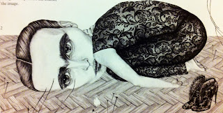
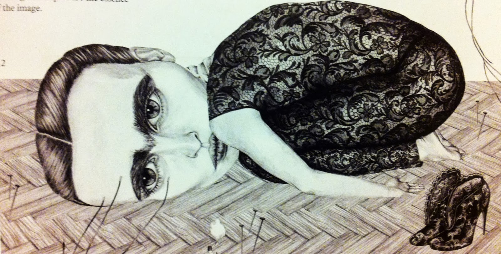
- 'The Broken Column' pencil drawing made for the magazine Fashion Tale by Annelie Carlstrom. Photoshop may have been used to clean and tiday up the image but strong drawing techniques are the essence of the image:
- 'Patch Dreams' 2010, personal work; collage by Takahiro Kimura (Tokyo, Japan). The process of collage enforces the meaning behind the work - 'Patch Dreams' by reminding the viewer of patchwork- pieces stuck together. This adds to the tone of the piece as it looks menacing and disturbing; the two characters seem stuck together too; they merge together even though they are separate parts:

- 'Shine like a Star' by Pinky uses the process of hand cutting paper. Building layers of colour utilising a similar method to the way in which a screen print is created, but using hand-cut coloured papers allows detail to slow through in a unique and varied way:


Practitioners (Collaboration)

- Vonhideki is the collaboration of illustrator Von and product designer Hideki. Launched in 2005, the team has had multiple exhibitions throughout London.

- Craig & Karl - they live in different parts of the world but collaborate daily to create bold work that is filled with simple messages executed in a thoughtful and often humorous way. They've exhibited across the world, most notably at the Musee de la Publicite, Louvre, and they have worked on projects for clients like LVMH, Google, Nike, Apple, Vogue and The New York Times.

- Angela Hendricks collaborated with her four year old daughter to create work:
- Asos limited edition clothing paired up with illustrators, explained on Itsnicethat.com : 'On several occasions in 2011 we were delighted to work with clothing company ASOS who asked us to call on some of our favourite creatives to produce bespoke, limited edition collections.The first of these was Limited Editions which saw us commission ten up-and-coming designers and illustrators to create ten designs for bespoke T-Shirts, and buyers also got the original work as an accompanying print. Creatives taking part included Greg Eason, Owen Gatley, Rob Matthews, Rose Blake and Sophie Kern.'

- Illustrated People collaborating with London Youth 'Illustrated People for London is an ongoing initiative from IP to promote a selection of the most exciting and emerging artists in London. It’s about representing the next generation of music, culture, fashion and art as they journey into the spotlight of popular culture.We aim to capture this unique time and highlight the ever-growing creative undercurrent in London as it is today.'


No comments:
Post a Comment